


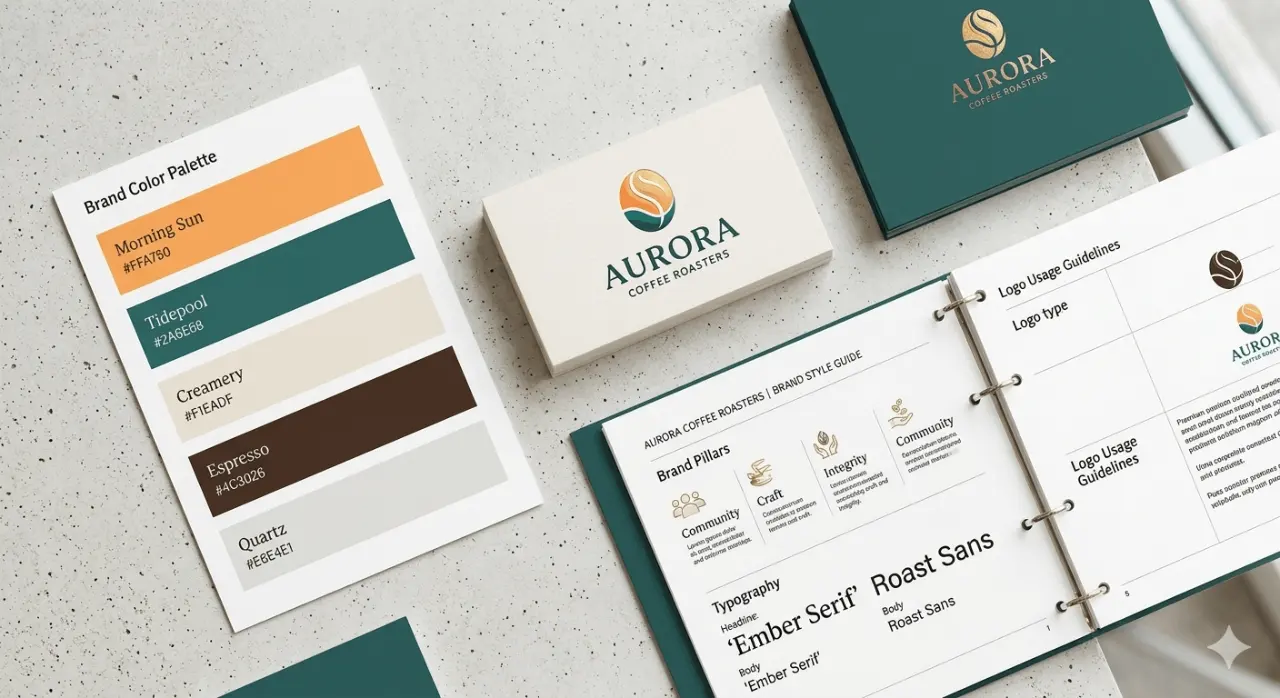
Your logo, colors and typography speak before your copy does. Before a visitor reads a single headline, they have already decided whether your business looks professional, trustworthy and worth their time. That first impression is your brand identity at work.
What brand identity really means
Brand identity is the visible side of your business: the logo, color palette, fonts, imagery, tone of voice and the way all of these come together on your website, social media and printed materials. It is not just a logo. It is the system that makes your business recognizable everywhere a customer meets it.
Why people trust what looks consistent
People use visual shortcuts to judge credibility. When a business looks the same on its website, its Google profile, its invoices and its Instagram, it signals organization and care. When every touchpoint looks different, it quietly raises doubts, even if the service itself is excellent.
- Consistency feels reliable. A steady look tells customers you will deliver the same quality every time.
- Professional design signals investment. Customers assume a business that invests in its image also invests in its work.
- Recognition builds familiarity. The more often people see the same colors and logo, the more comfortable they feel choosing you.
The core elements of a strong identity
1. A logo that works everywhere
A good logo is simple enough to read on a phone screen, a storefront sign and a favicon. Ask for versions in full color, one color and white so it always fits the background it sits on.
2. A focused color palette
Pick one or two main brand colors and a few neutrals. Use them the same way every time, for example one color for buttons and calls to action, another for headings. Fewer colors used consistently look more confident than many colors used at random.
3. Typography with a clear hierarchy
Choose a heading font and a body font that pair well, then stick to them. Clear font sizes for headings, subheadings and body text make your content easier to scan and instantly more polished.
4. Imagery and tone of voice
Real photos of your team, work and customers build more trust than generic stock images. Match them with a consistent tone of voice, whether that is friendly and casual or calm and expert.
Common branding mistakes that cost trust
- Using a different logo or color on every platform
- Stretching, cropping or recoloring the logo to fit a space
- Mixing too many fonts on one page
- Low quality or pixelated images on the website
- A website that looks nothing like your social media or printed materials
How to build trust before you say a word
Start with a simple brand guide: your logo files, color codes, fonts and a few examples of how to use them. Then update your highest-traffic touchpoints first, usually your website, Google Business Profile and main social channels. Once these match, every new ad, post or flyer becomes easier to create and more effective.
Final thoughts
A strong brand identity works for you around the clock. It makes your business look established, helps customers remember you and gives them the confidence to reach out. If your brand feels inconsistent or outdated, a focused refresh can change how customers see you before they read a single word.
Ready to build a brand people trust? See our branding and design services.